 Documentation
Documentation
Documentation
Thank you for purchasing iconic theme! We’re glad that you found what you were looking for. It is our goal that you are always happy with what you bought from us, and We hope that you will be able to create an outstanding website with our theme easily.
Before proceeding with the theme installation, It is recommended that you follow the steps listed below. We have covered all kinds of necessary information, and provide you with all the guidelines and details that you will need to use iconic theme. If you can’t find the answer you’re looking for, We encourage you to reach us through our Support portal. We'll be glad to help you out in your queries.
Follow the steps below to setup your site template:
Includes all assets and html files, used in theme
Includes all .css files, used in theme
Includes all images, used in .html files.
Includes font icon .css files, used in theme
Includes plugin's initialization file
Includes all slick slider .css and js files, used in theme
Includes all particles-js .css and js files, used in theme
Includes baguette-box-js .css and js files, used in theme for filtering the item through price
Includes all elements or shortcodes
iconic follows a simple and easy to customize coding structure. Here is the sample for your reference:
<!doctype html>
    <html>
        <head>
            <!-- title -->
            <meta charset="utf-8">
            <!-- description -->
            <meta name="description" content="">
            <!-- keywords -->
            <meta name="keywords" content="">
            <!-- favicon -->
            <!-- style -->
            <!-- bootstrap css -->
            <!-- theme css -->
            <!-- custom css -->
        </head>
        <body>
            <!-- header start -->
            <header>
                <!-- navigation start  -->
                    <nav class="navbar navbar-expand-lg fixed-top navbar-light">
                                ...
                    </nav>
                <!-- navigation end -->
            </header>
            <!-- header end -->
            <!-- sections start -->
                <section>
                    ...
                </section>
            <!-- sections end -->
            <!-- footer start -->
                <footer>

                </footer>
            <!-- footer end -->
            <!-- javascript & css libraries -->
    </body>
</html>
The Logo Container can be found in the Header --> Nav --> Container - .navbar-brand
<a class="navbar-brand" href="index.html">
    <img src="img/logo.png" alt="" />
</a>
Image Settings
iconic download package does not contain images which are there in our online demo.
We are using placeholder images instead of real images. You will see the image code as mentioned below.
You can replace placeholder image url with your image url like img/yourimage.jpg
<img src="image path" alt="image alt text">
Favicon Settings
To change the favicon image of your site, you need to load a new ICO image in a site root or to point out a new address of the image.
<!-- favicon -->
<link rel="shortcut icon" href="img/favicon.png">
<link rel="apple-touch-icon" href="img/apple-touch-icon-57x57.png">
<link rel="apple-touch-icon" sizes="72x72" href="img/apple-touch-icon-72x72.png">
<link rel="apple-touch-icon" sizes="114x114" href="img/apple-touch-icon-114x114.png">
By default, iconic uses the Google fonts. In case, If you want to change font to any other Google fonts. You can change the fonts from /css/style.css file in below lines.
/* Google font */
@import url(https://fonts.googleapis.com/css?family=Montserrat|Montserrat+Alternates|Open+Sans|Open+Sans+Condensed:300|Rajdhani|Roboto|Roboto+Condensed|Source+Sans+Pro);
@import url('https://fonts.googleapis.com/css2?family=Poppins:ital,wght@0,100;0,200;0,300;0,400;0,500;0,600;0,700;0,800;1,100;1,200;1,300;1,400;1,500;1,600;1,700&display=swap');
To change the font, first go to Google fonts, choose your desired font and use the generated code.
If you have a need to use custom fonts, Remove above section completely and visit Self Hosted Fonts
If you want to setup right-to-left styling, You just need to add lang="ar" on HTML tag (<html lang="ar"></html>) of each page. See example below:
<!doctype html>
<html lang="ar"> <!-- set lang="ar" for RTL -->
    <head>
        ...
    </head>
    <body>
        ...
    </body>
</html>
Note
LTR are enabled by default. If you wish to enable the RTL styling you can simply add lang="ar" above code from all HTML files.
you will need to add custom CSS through a separate CSS file.
You just need to link custom.css at the end of <head> tag of each page. See example below:
<link rel="stylesheet" type="text/css" href="css/custom.css" />
Beautiful particles js effect to display your content with attractive look. See below image and code for more information.

<div id="particles-js"></div>
<!--particles js-->
<script src="assets/particles/particles.js"></script>

<!--use one of the below JS link-->
<script src="assets/particles/js/app.js"></script> <!--effect one-->
<script src="assets/particles/js/app-02.js"></script> <!--effect two-->
<script src="assets/particles/js/app-03.js"></script> <!--effect three-->
You can also use particles js.
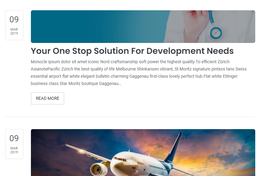
You can choose between 6 Types of page titles while creating your pages. The list of page title options & its descriptions are provided below for your reference:
It includes page title with alligned left, sub title under page title and breadcrumb in right part. See below image and code for more inforamtion.
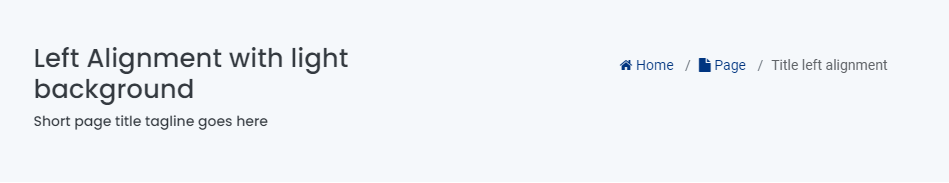
<!-- page title section start -->
<section class="site-title light-title">
    <div class="container">
        <div class="row">
            <div class="col-12 col-md-6 col-lg-6">
                <!-- page title start -->
                <h1> Left alignment with light background </h1>
                <!-- page title end -->
                <!-- sub title start -->
                <h6> Short page title tagline goes here </h6>
                <!-- sub title end -->
            </div>
            <div class="col-12 col-md-6 col-lg-6 text-sm-right text-md-right text-lg-right">
                <!-- breadcrumb start -->
                <nav aria-label="breadcrumb">
                    <ol class="breadcrumb">
                        <li class="breadcrumb-item active"> <a href="index.html"><i class="fa fa-home"></i> Home </a></li>
                        <li class="breadcrumb-item"> <a href="page-title.html"><i class="fa fa-file"></i> Page </a></li>
                        <li class="breadcrumb-item"> Title left alignment </li>
                    </ol>
                </nav>
                <!-- breadcrumb start -->
            </div>
        </div>
    </div>
</section>
<!-- page title section end -->
Note You can find Page Title demo or code in elements/page-title.html page for your reference..
It includes page title and sub title alligned center. See below image and code for more inforamtion.
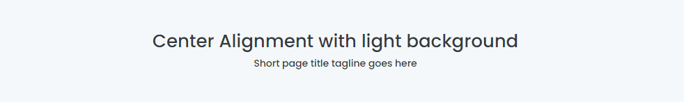
<!-- page title section start -->
<section class="site-title light-title text-center">
    <div class="container">
        <!-- page title start -->
        <h1> Center alignment with light background </h1>
        <!-- page title end -->
        <!-- sub title start -->
        <h6> Short page title tagline goes here </h6>
        <!-- sub title end -->
    </div>
</section>
<!-- page title section end -->
Note You can find Page Title demo or code in elements/page-title.html page for your reference..
It includes page title and sub title alligned center with dark background and light sub title. See below image and code for more inforamtion.
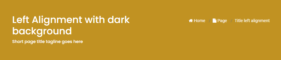
<!-- page title section start -->
<section class="site-title dark-title">
    <div class="container">
        <div class="row">
            <div class="col-12 col-md-6 col-lg-6">
                <!-- page title start -->
                <h1> Left alignment with dark background </h1>
                <!-- page title end -->
                <!-- sub title start -->
                <h6> Short page title tagline goes here </h6>
                <!-- sub title end -->
            </div>
            <div class="col-12 col-md-6 col-lg-6 text-sm-right text-md-right text-lg-right">
                <!-- breadcrumb  start -->
                <nav aria-label="breadcrumb">
                    <ol class="breadcrumb">
                        <li class="breadcrumb-item active"> <a href="index.html"><i class="fa fa-home"></i> Home </a></li>
                        <li class="breadcrumb-item"> <a href="page-title.html"><i class="fa fa-file"></i> Page </a></li>
                        <li class="breadcrumb-item"> Title left alignment </li>
                    </ol>
                </nav>
                <!-- breadcrumb start -->
            </div>
        </div>
    </div>
</section>
<!-- page title section end -->
Note You can find Page Title demo or code in elements/page-title.html page for your reference..
It includes page title and sub title alligned center with breadcrumbs at the bottm of page title. See below image and code for more inforamtion.

<!-- page title section start -->
<section class="site-title image-title overlay text-center" style=" background: url(../img/blog-banner.png);">
    <div class="container">
        <!-- page title start -->
        <h1> Center alignment with image background </h1>
        <!-- page title end -->
        <!-- sub title start -->
        <h6> Short page title tagline goes here </h6>
        <!-- sub title end -->

        <!-- breadcrumb start -->
        <nav aria-label="breadcrumb">
            <ol class="breadcrumb">
                <li class="breadcrumb-item active"> <a href="index.html"><i class="fa fa-home"></i> Home </a></li>
                <li class="breadcrumb-item"> <a href="page-title.html"><i class="fa fa-file"></i> Page </a></li>
                <li class="breadcrumb-item"> Title center alignment </li>
            </ol>
        </nav>
        <!-- breadcrumb start -->
    </div>
</section>
<!-- page title section end -->
Note You can find Page Title demo or code in elements/page-title.html page for your reference..
It includes page title and sub title alligned center with breadcrumbs at the bottm of page title. See below image and code for more inforamtion.
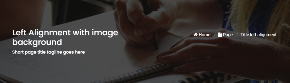
<!-- page title section start -->
<section class="site-title image-title overlay" style=" background: url(../img/blog-banner.png);">
    <div class="container">
        <div class="row">
            <div class="col-12 col-md-6 col-lg-6">
                <!-- page title start -->
                <h1> Left alignment with image background </h1>
                <!-- page title end -->
                <!-- sub title start -->
                <h6> Short page title tagline goes here </h6>
                <!-- sub title end -->
            </div>
            <div class="col-12 col-md-6 col-lg-6 text-sm-right text-md-right text-lg-right">
                <!-- breadcrumb start -->
                <nav aria-label="breadcrumb">
                    <ol class="breadcrumb">
                        <li class="breadcrumb-item active"> <a href="index.html"><i class="fa fa-home"></i> Home </a></li>
                        <li class="breadcrumb-item"> <a href="page-title.html"><i class="fa fa-file"></i> Page </a></li>
                        <li class="breadcrumb-item"> Title left alignment </li>
                    </ol>
                </nav>
                <!-- breadcrumb start -->
            </div>
        </div>
    </div>
</section>
<!-- page title section end -->
Note You can find Page Title demo or code in elements/page-title.html page for your reference..
You can choose between 3 Types of page layout while creating your page. The list of page layout options & its descriptions are provided below for your reference:
<!-- navigation start -->
<header>
    <div class="container-fluid">
        <nav class="navbar navbar-expand-lg navbar-light bg-white">
            ...
        </nav>
    </div>
</header>
<!--navigation end -->
<!-- page title start -->
<section class="banner-blog overlay" style=" background: url(../img/blog-banner.png) no-repeat; background-size: cover;">
    <div class="container-fluid">
    <h1> About iconic </h1>
        ...
    </div>
</section>
<!-- page title end -->
<!-- page content start -->
<section>
    <div class="container-fluid">
        <div class="row">
            <!-- content start -->
            <div class="col-12">
                ...
            </div>
            <!-- content end -->
        </div>
    </div>
</section>
<!-- page content end-->
<!-- footer start -->
<footer>
    ...
</footer>
<!-- footer end-->
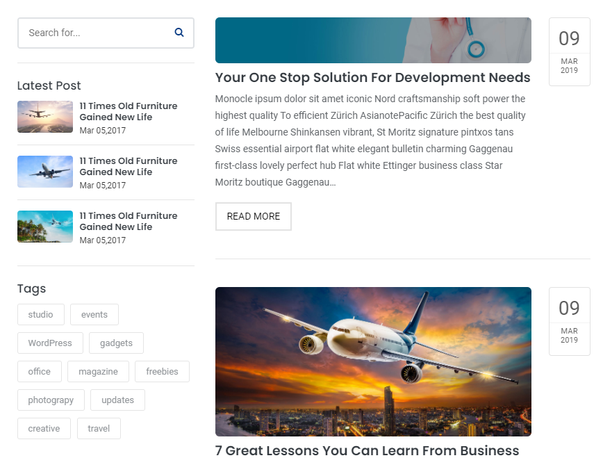
<!-- navigation start -->
<header>
    <div class="container-fluid">
        <nav class="navbar navbar-expand-lg navbar-light bg-white">
            ...
        </nav>
    </div>
</header>
<!--navigation end -->
<!-- page title start -->
<section class="banner-blog overlay" style=" background: url(../img/blog-banner.png) no-repeat; background-size: cover;">
    <div class="container-fluid">
    <h1> About iconic </h1>
        ...
    </div>
</section>
<!-- page title end -->
<!-- page content start -->
<section>
    <div class="container-fluid">
        <div class="row">
            <!-- side bar start -->
            <aside class="col-md-3 col-lg-3">
                ...
            </aside>
            <!-- side bar end -->
            <!-- main section start -->
            <main class="col-md-9 col-lg-9">
                ...
            </main>
            <!-- main section end -->
        </div>
    </div>
</section>
<!-- page content end-->
<!-- footer start -->
<footer>
    ...
</footer>
<!-- footer end-->
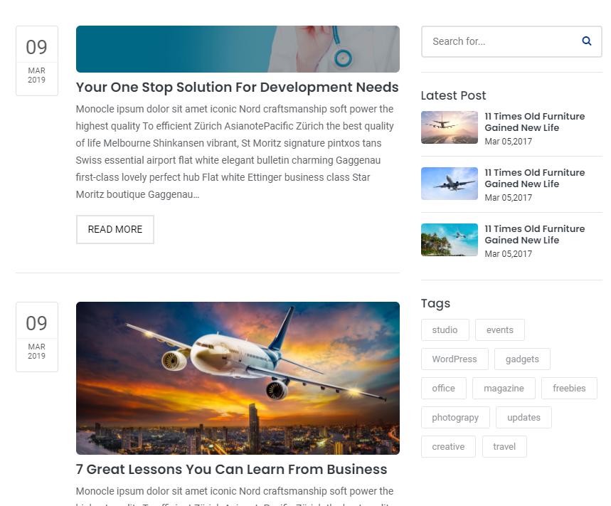
<!-- navigation start -->
<header>
    <div class="container-fluid">
        <nav class="navbar navbar-expand-lg navbar-light bg-white">
            ...
        </nav>
    </div>
</header>
<!--navigation end -->
<!-- page title start -->
<section class="banner-blog overlay" style=" background: url(../img/blog-banner.png) no-repeat; background-size: cover;">
    <div class="container-fluid">
    <h1> About iconic </h1>
        ...
    </div>
</section>
<!-- page title end -->
<!-- page content start -->
<section>
    <div class="container-fluid">
        <div class="row">
            <!-- main section start -->
            <main class="col-md-9 col-lg-9">
                ...
            </main>
            <!-- main section end -->
            <!-- side bar start -->
            <aside class="col-md-3 col-lg-3">
                ...
            </aside>
            <!-- side bar end -->
        </div>
    </div>
</section>
<!-- page content end-->
<!-- footer start -->
<footer>
    ...
</footer>
<!-- footer end-->
Note You can find code in blog.html page for your reference.
Basic grid layouts to get you familiar with building within the Bootstrap grid system.
we migrate entire theme in Bootstrap 4, so you can find detaild documentation on grid here:
https://getbootstrap.com/docs/4.3/layout/grid/
You can add this helper class to any element in your HTML code to set text color:
| Class name | Description |
|---|---|
.text-primary |
Main primary color text |
.text-white |
White color text |
.text-dark |
Dark color text |
You can also use bootstrap color classes.
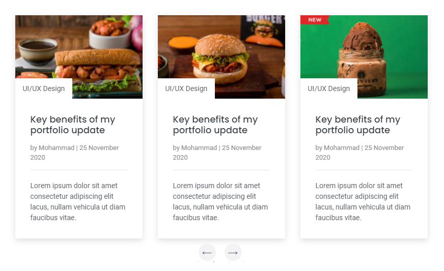
<div class="sliderOne">
     <!--Item 01-->
	<div>
	    <div class="blog-design-five">
                <a href="#!">
                    <img src="img/your-image-01.jpg" alt="" / >
                </a>
                <div class="blog-design-five-text">
                    <a href="#!" class="blog-design-five-category">UI/UX Design </a>
                    <a href="#!">
                        <h2> Key benefits of my portfolio update</h2>
                    </a>
                    <div class="blog-design-five-author">
                        <span> by <a href="#!"> Mohammad</a> | 25 November 2020</span>
                    </div>
                    <p> Lorem ipsum dolor sit amet consectetur adipiscing elit lacus, nullam vehicula ut diam faucibus vitae. </p>
                </div>
	    </div>
    </div>

     <!--Item 02-->
	<div>
	    <div class="blog-design-five">
                <a href="#!">
                    <img src="img/your-image-02.jpg" alt="" / >
                </a>
                <div class="blog-design-five-text">
                    <a href="#!" class="blog-design-five-category">UI/UX Design </a>
                    <a href="#!">
                        <h2> Key benefits of my portfolio update</h2>
                    </a>
                    <div class="blog-design-five-author">
                        <span> by <a href="#!"> Mohammad</a> | 25 November 2020</span>
                    </div>
                    <p> Lorem ipsum dolor sit amet consectetur adipiscing elit lacus, nullam vehicula ut diam faucibus vitae. </p>
                </div>
	    </div>
    </div>

     <!--Item 03-->
	<div>
	    <div class="blog-design-five">
                <a href="#!">
                    <img src="img/your-image-03.jpg" alt="" / >
                </a>
                <div class="blog-design-five-text">
                    <a href="#!" class="blog-design-five-category">UI/UX Design </a>
                    <a href="#!">
                        <h2> Key benefits of my portfolio update</h2>
                    </a>
                    <div class="blog-design-five-author">
                        <span> by <a href="#!"> Mohammad</a> | 25 November 2020</span>
                    </div>
                    <p> Lorem ipsum dolor sit amet consectetur adipiscing elit lacus, nullam vehicula ut diam faucibus vitae. </p>
                </div>
	    </div>
    </div>

     <!--Item 04-->
	<div>
	    <div class="blog-design-five">
                <a href="#!">
                    <img src="img/your-image-04.jpg" alt="" / >
                </a>
                <div class="blog-design-five-text">
                    <a href="#!" class="blog-design-five-category">UI/UX Design </a>
                    <a href="#!">
                        <h2> Key benefits of my portfolio update</h2>
                    </a>
                    <div class="blog-design-five-author">
                        <span> by <a href="#!"> Mohammad</a> | 25 November 2020</span>
                    </div>
                    <p> Lorem ipsum dolor sit amet consectetur adipiscing elit lacus, nullam vehicula ut diam faucibus vitae. </p>
                </div>
	    </div>
	</div>
</div>
$(document).on('ready', function() {
    $('.sliderOne').slick({
        dots: false, // You can control the bullets to show or hide
        infinite: false,
        speed: 300, // You can control the speed of slides
        slidesToShow: 3, // You can control the no. of items to display on the screen
        slidesToScroll: 1, // You can control the no. of items to display on the scroll
        responsive: [ // this code is used to control the responsiveness of silde only
            {
            breakpoint: 1024,
            settings: {
                slidesToShow: 2,
                slidesToScroll: 3,
                infinite: true,
                dots: true
            }
            },
            {
            breakpoint: 767,
            settings: {
                slidesToShow: 1,
                slidesToScroll: 2
            }
            },
            {
            breakpoint: 480,
            settings: {
                slidesToShow: 1,
                slidesToScroll: 1
            }
            }
        ]
});
Note You can find slick slider - all code available in elements/carousels.html page and above is the code for your reference.
<div id="carouselExampleCaptions" class="carousel slide sliderSix" data-ride="carousel">
    <ol class="carousel-indicators">
        <li data-target="#carouselExampleCaptions" data-slide-to="0" class="active"> </li>
        <li data-target="#carouselExampleCaptions" data-slide-to="1"> </li>
        <li data-target="#carouselExampleCaptions" data-slide-to="2"> </li>
    </ol>
    <div class="carousel-inner">
        <div class="carousel-item active">
            <img src="img/your-image-01.jpg" class="d-block w-100" alt="">
            <div class="carousel-caption d-none d-md-block">
                <h5> First slide label </h5>
                <p> Nulla vitae elit libero, a pharetra augue mollis interdum. </p>
            </div>
        </div>

        <div class="carousel-item">
            <img src="img/your-image-02.jpg" class="d-block w-100" alt="">
            <div class="carousel-caption d-none d-md-block">
                <h5> First slide label </h5>
                <p> Nulla vitae elit libero, a pharetra augue mollis interdum. </p>
            </div>
        </div>
    </div>
    <a class="carousel-control-prev" href="#carouselExampleCaptions" role="button" data-slide="prev">
        <span class="carousel-control-prev-icon" aria-hidden="true"> </span>
        <span class="sr-only"> Previous </span>
    </a>
    <a class="carousel-control-next" href="#carouselExampleCaptions" role="button" data-slide="next">
        <span class="carousel-control-next-icon" aria-hidden="true"> </span>
        <span class="sr-only"> Next </span>
    </a>
</div>
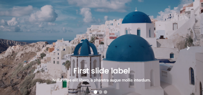
Note You can also use Bootstrap carousel.
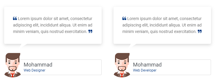
Beautiful testimonial layouts to display your content with attractive look. See below image and code for more information.
<div class="container">
    <div class="row">
         <!--Item 01-->
        <div class="col-12 col-md-4">
            <div class="testi-con">
                <p>
                    <i class="fa fa-quote-left"> </i>
                    Lorem ipsum dolor sit amet, consectetur adipiscing elit,
                    incididunt aliqua. Ut enim ad minim veniam,
                    quis nostrud exercitation.
                    <i class="fa fa-quote-right"> </i>
                </p>
            </div>
            <div class="triangle-down"> </div>
            <div class="testi-con-name">
                <img src="img/your-imag-01.png" alt="">
                Mohammad
                <p> Web Designer </p>
            </div>
        </div>

         <!--Item 02-->
        <div class="col-12 col-md-4">
            <div class="testi-con">
                <p>
                    <i class="fa fa-quote-left"> </i>
                    Lorem ipsum dolor sit amet, consectetur adipiscing elit,
                    incididunt aliqua. Ut enim ad minim veniam,
                    quis nostrud exercitation.
                    <i class="fa fa-quote-right"> </i>
                </p>
            </div>
            <div class="triangle-down"> </div>
            <div class="testi-con-name">
                <img src="img/your-imag-02.png" alt="">
                Mohammad
                <p> Web Designer </p>
            </div>
        </div>

         <!--Item 03-->
        <div class="col-12 col-md-4">
            <div class="testi-con">
                <p>
                    <i class="fa fa-quote-left"> </i>
                    Lorem ipsum dolor sit amet, consectetur adipiscing elit,
                    incididunt aliqua. Ut enim ad minim veniam,
                    quis nostrud exercitation.
                    <i class="fa fa-quote-right"> </i>
                </p>
            </div>
            <div class="triangle-down"> </div>
            <div class="testi-con-name">
                <img src="img/your-imag-03.png" alt="">
                Mohammad
                <p> Web Designer </p>
            </div>
        </div>
    </div>
</div>
Note For demo, You can please check this in elements/testimonials.html.
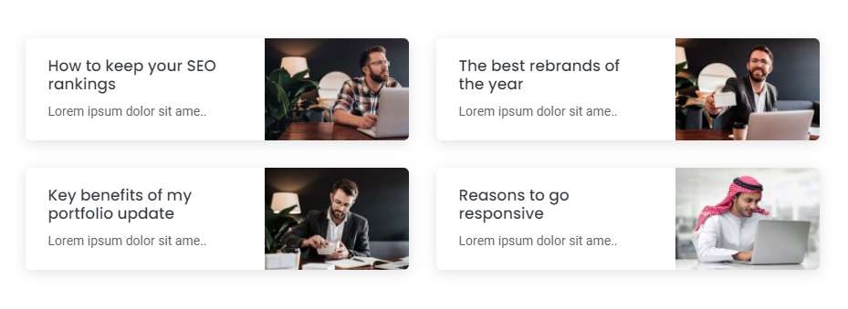
Beautiful blog post layouts to display your content with attractive look. See below image and code for more information.
<div class="container">
    <div class="row">
        <!--Blog item 01-->
        <div class="col-12 col-md-6 col-lg-6">
            <div class="blog-design-one-item">
                <div class="row">
                    <div class="col-12 col-sm-7 col-md-12 col-lg-7">
                        <div class="blog-design-one-text">
                            <a href="#!">
                                <h2>
                                    How to keep your SEO rankings
                                </h2>
                            </a>
                            <p> Lorem ipsum dolor sit amet consectetur, adipiscing elit arcu urna. </p>
                        </div>
                    </div>
                    <div class="col-12 col-sm-5 col-md-12 col-lg-5">
                        <a href="#!">
                            <img src="img/your-image-01.jpg" alt="" />
                        </a>
                    </div>
                </div>
            </div>
        </div>

        <!--Blog item 02-->
        <div class="col-12 col-md-6 col-lg-6">
            <div class="blog-design-one-item">
                <div class="row">
                    <div class="col-12 col-sm-7 col-md-12 col-lg-7">
                        <div class="blog-design-one-text">
                            <a href="#!">
                                <h2>
                                    How to keep your SEO rankings
                                </h2>
                            </a>
                            <p> Lorem ipsum dolor sit amet consectetur, adipiscing elit arcu urna. </p>
                        </div>
                    </div>
                    <div class="col-12 col-sm-5 col-md-12 col-lg-5">
                        <a href="#!">
                            <img src="img/your-image-02.jpg" alt="" />
                        </a>
                    </div>
                </div>
            </div>
        </div>

        <!--Blog item 03-->
        <div class="col-12 col-md-6 col-lg-6">
            <div class="blog-design-one-item">
                <div class="row">
                    <div class="col-12 col-sm-7 col-md-12 col-lg-7">
                        <div class="blog-design-one-text">
                            <a href="#!">
                                <h2>
                                    How to keep your SEO rankings
                                </h2>
                            </a>
                            <p> Lorem ipsum dolor sit amet consectetur, adipiscing elit arcu urna. </p>
                        </div>
                    </div>
                    <div class="col-12 col-sm-5 col-md-12 col-lg-5">
                        <a href="#!">
                            <img src="img/your-image-03.jpg" alt="" />
                        </a>
                    </div>
                </div>
            </div>
        </div>
    </div>
</div>
Note For demo, You can please check this in elements/blog.html.
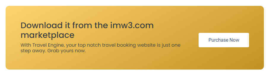
Beautiful call to action layouts to display your content with attractive look. See below image and code for more information.
<div class="cal-to-action">
    <div class="row">
        <div class="col-12 col-md-8 col-lg-9">
            <h3> Download it from the imw3.com marketplace </h3>
            <h6>
               With iconic, your top notch company website
                is just one step away. Grab yours now.
            </h6>
        </div>
        <div class="col-12 col-md-4 col-lg-3 dflex">
            <a href="#!"> Purchase Now </a>
        </div>
     </div>
</div>
Note For demo, You can please check this in elements/call-to-action.html.
Beautiful sliders layouts to display your content with attractive look. See below image and code for more information.
<div class="sliderOne">
     <!--Item 01-->
	<div>
	    <div class="blog-design-five">
                <a href="#!">
                    <img src="img/your-image-01.jpg" alt="" / >
                </a>
                <div class="blog-design-five-text">
                    <a href="#!" class="blog-design-five-category">UI/UX Design </a>
                    <a href="#!">
                        <h2> Key benefits of my portfolio update</h2>
                    </a>
                    <div class="blog-design-five-author">
                        <span> by <a href="#!"> Mohammad</a> | 25 November 2020</span>
                    </div>
                    <p> Lorem ipsum dolor sit amet consectetur adipiscing elit lacus, nullam vehicula ut diam faucibus vitae. </p>
                </div>
	    </div>
    </div>

     <!--Item 02-->
	<div>
	    <div class="blog-design-five">
                <a href="#!">
                    <img src="img/your-image-02.jpg" alt="" / >
                </a>
                <div class="blog-design-five-text">
                    <a href="#!" class="blog-design-five-category">UI/UX Design </a>
                    <a href="#!">
                        <h2> Key benefits of my portfolio update</h2>
                    </a>
                    <div class="blog-design-five-author">
                        <span> by <a href="#!"> Mohammad</a> | 25 November 2020</span>
                    </div>
                    <p> Lorem ipsum dolor sit amet consectetur adipiscing elit lacus, nullam vehicula ut diam faucibus vitae. </p>
                </div>
	    </div>
    </div>

     <!--Item 03-->
	<div>
	    <div class="blog-design-five">
                <a href="#!">
                    <img src="img/your-image-03.jpg" alt="" / >
                </a>
                <div class="blog-design-five-text">
                    <a href="#!" class="blog-design-five-category">UI/UX Design </a>
                    <a href="#!">
                        <h2> Key benefits of my portfolio update</h2>
                    </a>
                    <div class="blog-design-five-author">
                        <span> by <a href="#!"> Mohammad</a> | 25 November 2020</span>
                    </div>
                    <p> Lorem ipsum dolor sit amet consectetur adipiscing elit lacus, nullam vehicula ut diam faucibus vitae. </p>
                </div>
	    </div>
    </div>

     <!--Item 04-->
	<div>
	    <div class="blog-design-five">
                <a href="#!">
                    <img src="img/your-image-04.jpg" alt="" / >
                </a>
                <div class="blog-design-five-text">
                    <a href="#!" class="blog-design-five-category">UI/UX Design </a>
                    <a href="#!">
                        <h2> Key benefits of my portfolio update</h2>
                    </a>
                    <div class="blog-design-five-author">
                        <span> by <a href="#!"> Mohammad</a> | 25 November 2020</span>
                    </div>
                    <p> Lorem ipsum dolor sit amet consectetur adipiscing elit lacus, nullam vehicula ut diam faucibus vitae. </p>
                </div>
	    </div>
	</div>
</div>
$(document).on('ready', function() {
    $('.sliderOne').slick({
        dots: false, // You can control the bullets to show or hide
        infinite: false,
        speed: 300, // You can control the speed of slides
        slidesToShow: 3, // You can control the no. of items to display on the screen
        slidesToScroll: 1, // You can control the no. of items to display on the scroll
        responsive: [ // this code is used to control the responsiveness of silde only
            {
            breakpoint: 1024,
            settings: {
                slidesToShow: 2,
                slidesToScroll: 3,
                infinite: true,
                dots: true
            }
            },
            {
            breakpoint: 767,
            settings: {
                slidesToShow: 1,
                slidesToScroll: 2
            }
            },
            {
            breakpoint: 480,
            settings: {
                slidesToShow: 1,
                slidesToScroll: 1
            }
            }
        ]
});
Note For demo, You can please check this in elements/carousels.html.
Beautiful modals layouts to display your content with attractive look. See below image and code for more information.
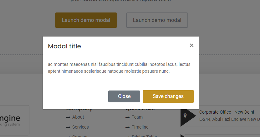
<!--modal button-->
<a data-toggle="modal" href="#defaultModal"> Launch demo modal </a>

<!--modal start-->
<div class="modal fade" id="defaultModal" tabindex="-1" aria-labelledby="exampleModalLabel" aria-hidden="true">
    <div class="modal-dialog">
        <div class="modal-content">
            <div class="modal-header">
                <h5 class="modal-title" id="exampleModalLabel"> Modal title </h5>
                <button type="button" class="close" data-dismiss="modal" aria-label="Close">
                    <span aria-hidden="true"> × </span>
                </button>
            </div>
            <div class="modal-body">
                <p>
                    Lorem ipsum dolor sit amet consectetur adipiscing elit faucibus aptent.
                </p>
            </div>
            <div class="modal-footer">
                <button type="button" class="btn btn-secondary" data-dismiss="modal"> Close </button>
                <button type="button" class="btn btn btn-desin-one"> Save changes </button>
            </div>
        </div>
    </div>
</div>
<!--modal end-->
Note For demo, You can please check this in elements/modal.html.
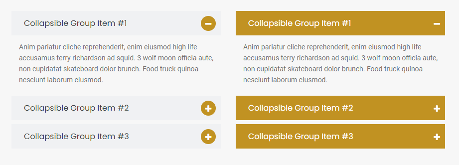
Beautiful accordion layouts to display your content with attractive look. See below image and code for more information.
<div class="panel-group accordion-design-three" id="accordionThree" role="tablist" aria-multiselectable="true">
    <!--items 01-->
    <div class="panel panel-default">
        <div class="panel-heading">
            <h4 class="panel-title">
                <a data-toggle="collapse" href="#collapse1" aria-expanded="true">
                        Collapsible Group Item #1

                    <i class="fa fa-plus" style="display: none"> </i>
                    <i class="fa fa-minus"> </i>
                </a>
            </h4>
        </div>
        <div id="collapse1" class="panel-collapse collapse show" data-parent="#accordionThree">
            <div class="panel-body">
                Anim pariatur cliche reprehenderit, enim eiusmod high life
                accusamus terry richardson ad squid..
            </div>
        </div>
    </div>

    <!--items 02-->
    <div class="panel panel-default">
        <div class="panel-heading">
            <h4 class="panel-title">
                <a data-toggle="collapse" href="#collapse2" aria-expanded="true">
                        Collapsible Group Item #1

                    <i class="fa fa-plus"> </i>
                    <i class="fa fa-minus" style="display: none"> </i>
                </a>
            </h4>
        </div>
        <div id="collapse2" class="panel-collapse collapse" data-parent="#accordionThree">
            <div class="panel-body">
                Anim pariatur cliche reprehenderit, enim eiusmod high life
                accusamus terry richardson ad squid..
            </div>
        </div>
    </div>

    <!--items 03-->
    <div class="panel panel-default">
        <div class="panel-heading">
            <h4 class="panel-title">
                <a data-toggle="collapse" href="#collapse3" aria-expanded="true">
                        Collapsible Group Item #1

                    <i class="fa fa-plus"> </i>
                    <i class="fa fa-minus" style="display: none"> </i>
                </a>
            </h4>
        </div>
        <div id="collapse3" class="panel-collapse collapse" data-parent="#accordionThree">
            <div class="panel-body">
                Anim pariatur cliche reprehenderit, enim eiusmod high life
                accusamus terry richardson ad squid..
            </div>
        </div>
    </div>
</div>
$('.panel-collapse').on('show.bs.collapse', function () {
    $(this).parent('.panel').find('.fa-minus').show();
    $(this).parent('.panel').find('.fa-plus').hide();
})
$('.panel-collapse').on('hide.bs.collapse', function () {
    $(this).parent('.panel').find('.fa-minus').hide();
    $(this).parent('.panel').find('.fa-plus').show();
})
Note For demo, You can please check this in elements/accordions.html.
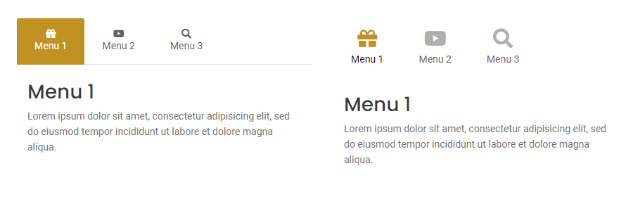
Beautiful tab layouts to display your content with attractive look. See below image and code for more information.
<div class="tab-design-five">
    <ul class="nav nav-tabs">
        <li class="nav-item">
            <a class="nav-link active" data-toggle="tab" href="#menu1"> <i class="fas fa-gift"> </i> Menu 1</a>
        </li>
        <li class="nav-item">
            <a class="nav-link" data-toggle="tab" href="#menu2"> <i class="fas fa-youtube"> </i> Menu 2</a>
        </li>
        <li class="nav-item">
            <a class="nav-link" data-toggle="tab" href="#menu3"> <i class="fas fa-search"> </i> Menu 3</a>
        </li>
    </ul>

    <!--tab panes-->
    <div class="tab-content">
        <div id="menu1" class="container tab-pane active">
            <h3> Menu 1 </h3>
            <p> Lorem ipsum dolor sit amet, consectetur adipisicing elit.. </p>
        </div>
        <div id="menu2" class="container tab-pane">
            <h3> Menu 1 </h3>
            <p> Lorem ipsum dolor sit amet, consectetur adipisicing elit.. </p>
        </div>
        <div id="menu3" class="container tab-pane">
            <h3> Menu 1 </h3>
            <p> Lorem ipsum dolor sit amet, consectetur adipisicing elit.. </p>
        </div>
    </div>
</div>
Note For demo, You can please check this in elements/tab.html.
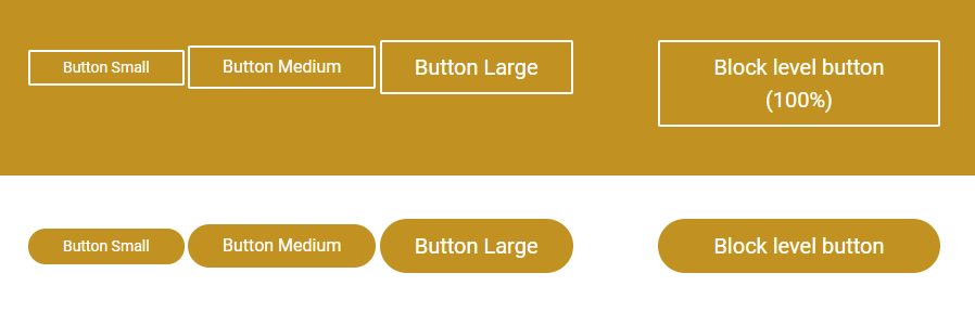
Beautiful buttons to display your content with attractive look. See below image and code for more information.
<a class="btn btn-sm btn-desin-four" href="#"> Button Small </a>
<a class="btn btn-desin-four" href="#"> Button Medium </a>
<a class="btn btn-lg btn-desin-four" href="#"> Button Large </a>
<a class="btn btn-lg btn-block btn-desin-four" href="#"> Block level button (100%) </a>

<a class="btn btn-sm btn-desin-five" href="#"> Button Small </a>
<a class="btn btn-desin-five" href="#"> Button Medium </a>
<a class="btn btn-lg btn-desin-five" href="#"> Button Large </a>
<a class="btn btn-lg btn-block btn-desin-five" href="#"> Block level button (100%) </a>
Note For demo, You can please check this in elements/button.html.
Beautiful feature box to display your content with attractive look. See below image and code for more information.
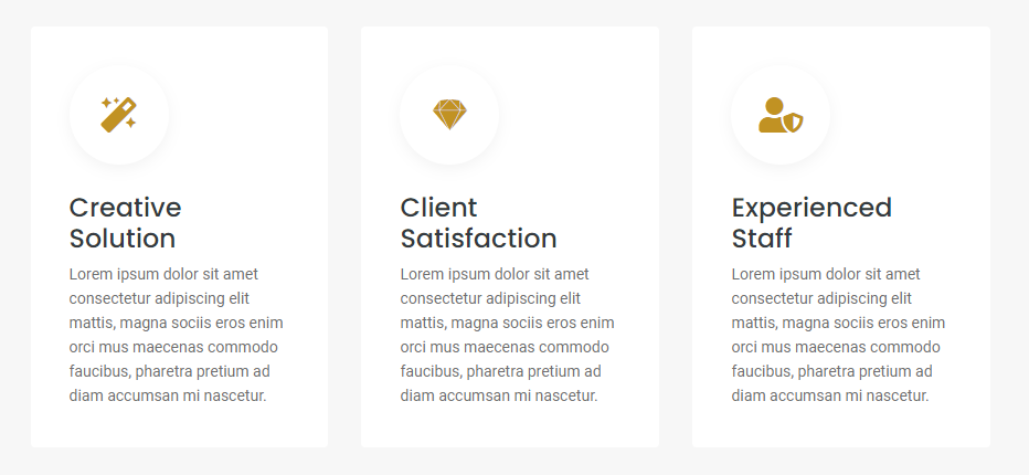
<div class="row">
    <div class="col-12 col-md-4 col-lg-4">
        <div class="feature-box-one">
            <i class="fas fa-magic"></i>
            <h3>Creative Solution</h3>
            <p>
                Lorem ipsum dolor sit amet consectetur adipiscing elit mattis, magna sociis eros
                enim orci mus maecenas commodo faucibus, pharetra pretium ad diam accumsan mi nascetur.
            </p>
        </div>
    </div>
    <div class="col-12 col-md-4 col-lg-4">
        <div class="feature-box-one">
            <i class="fas fa-magic"></i>
            <h3>Client Satisfaction</h3>
            <p>
                Lorem ipsum dolor sit amet consectetur adipiscing elit mattis, magna sociis eros
                enim orci mus maecenas commodo faucibus, pharetra pretium ad diam accumsan mi nascetur.
            </p>
        </div>
    </div>
    <div class="col-12 col-md-4 col-lg-4">
        <div class="feature-box-one">
            <i class="fas fa-magic"></i>
            <h3>Creative Solution</h3>
            <p>
                Lorem ipsum dolor sit amet consectetur adipiscing elit mattis, magna sociis eros
                enim orci mus maecenas commodo faucibus, pharetra pretium ad diam accumsan mi nascetur.
            </p>
        </div>
    </div>
    <div class="col-12 col-md-4 col-lg-4">
        <div class="feature-box-one">
            <i class="fas fa-magic"></i>
            <h3>Experienced Staff</h3>
            <p>
                Lorem ipsum dolor sit amet consectetur adipiscing elit mattis, magna sociis eros
                enim orci mus maecenas commodo faucibus, pharetra pretium ad diam accumsan mi nascetur.
            </p>
        </div>
    </div>
</div>
Note For demo, You can please check this in elements/features-box.html.
Beautiful contact form to display your content with attractive look. See below image and code for more information.
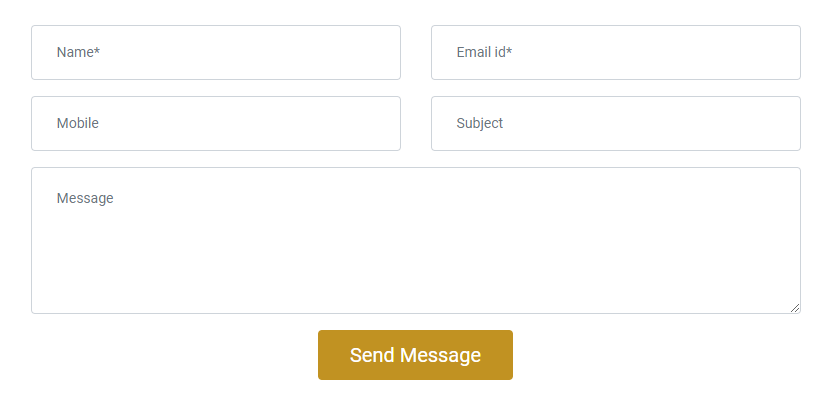
<form method="post" action="php/mail.php">
    <div class="row">
        <div class="col-sm-12">
            <div class="form-group">
                <input type="text" name="name" class="form-control" placeholder="Name*" required="">
            </div>
        </div>
        <div class="col-sm-12">
            <div class="form-group">
                <input type="email" name="email" class="form-control" placeholder="Email id*" required="">
            </div>
        </div>

        <div class="col-sm-12">
            <div class="form-group">
                <input type="text" name="subject" class="form-control" placeholder="Subject">
            </div>
        </div>

        <div class="col-sm-12">
            <div class="form-group">
                <textarea rows="3" name="message" placeholder="Message" required="" class="form-control"></textarea>
            </div>
        </div>

        <div class="col-sm-12">
            <div class="form-group">
                <button type="submit" class="btn btn-lg btn-desin-one rounded">Send Message
            </div>
        </div>
    </div>
</form>
To make contact form work, simply go to html/php/mail.php file.
Look out for $to .= 'your-email@gmail.com' on line number 9 and replace your email there.
If you want to redirect to other page after submission of data then replace URL at line number 59 in mail.php file
<?php
$name = $_POST['name'];
$mobile = $_POST['mobile'];
$email = $_POST['email'];
$subject = $_POST['subject'];
$message = $_POST['message'];

//your email address
$to .= 'your-email@gmail.com';

//mail subject
$subject = 'Website : Query from Contact Us Page';

// body
$message = "
<html>
<body>
  <table>
    <tr>
        <th>Name</th>
        <td>".$name."</td>
    </tr>
    <tr>
        <th>Mobile No.</th>
        <td>".$mobile."</td>
    </tr>
    <tr>
        <th>Email Id</th>
        <td>".$email."</td>
    </tr>
    <tr>
        <th>Subject</th>
        <td>".$subject."</td>
    </tr>
    <tr>
        <th>Message</th>
        <td>".$message."</td>
    </tr>
  </table>
</body>
</html>
";

// To send HTML mail, the Content-type header must be set
$headers  = 'MIME-Version: 1.0' . "\r\n";
$headers .= 'Content-type: text/html; charset=iso-8859-1' . "\r\n";

// Mail it
$res=mail($to, $subject, $message, $headers);
if($res)
{
// display message after submission of form
 echo "<script>alert('Mail has been sent successfully.'); window.location='http://your-domain.com/thanks' </script>";
}
?>
Note For demo, You can please check this in elements/contact-form.html.
Beautiful countdown to display your content with attractive look. See below image and code for more information.
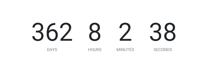
<div id="countdown" getTime="Dec 18, 2021 06:37:25" class="count-down-one"></div>
<!--countdown js-->
<script src="../assets/js/countdown.js"></script>
Note For demo, You can please check this in elements/countdown.html.
Beautiful counter to display your content with attractive look. See below image and code for more information.

<div class="row">
    <div class="col-6 col-md-3 col-lg-3">
        <div class="make">
            <div id="circle" class="shadow"><span class="counts">520</span></div>
            <h6>
                Happy Clients
            </h6>
        </div>
    </div>
    <div class="col-6 col-md-3 col-lg-3">
        <div class="make">
            <div id="circle" class="shadow"><span class="counts">520</span></div>
            <h6>
                Work Completed
            </h6>
        </div>
    </div>
    <div class="col-6 col-md-3 col-lg-3">
        <div class="make">
            <div id="circle" class="shadow"><span class="counts">520</span></div>
            <h6>
                Cup of Coffee
            </h6>
        </div>
    </div>
    <div class="col-6 col-md-3 col-lg-3">
        <div class="make">
            <div id="circle" class="shadow"><span class="counts">520</span></div>
            <h6>
                Telephonic Talk
            </h6>
        </div>
    </div>
</div>
<!--counter js-->
<script src="../assets/js/counter.js"></script>
Note For demo, You can please check this in elements/counter.html.
Beautiful dropcaps to display your content with attractive look. See below image and code for more information.

<p>
    <span class="dropcaps-one">M</span> <!--dropcap js-->
    Lorem ipsum dolor sit amet consectetur adipiscing elit,
    mattis primis curae fringilla mus nam ridiculus non,
    sem malesuada sollicitudin varius fermentum auctor.
</p>
Note For demo, You can please check this in elements/dropcaps.html.
Beautiful list style to display your content with attractive look. See below image and code for more information.
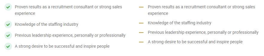
<ul class="list-style-one">
    <li>Proven results as a recruitment consultant or strong sales experience</li>
    <li>Knowledge of the staffing industry</li>
    <li>Previous leadership experience, personally or professionally</li>
    <li>A strong desire to be successful and inspire people</li>
</ul>
Note For demo, You can please check this in elements/lists.html.
Beautiful parallax scrolling to display your content with attractive look. See below image and code for more information.

<section class="parallax-one" style="background-image: url(../assets/img/slider-01.jpg);">
    <!-- your content -->
</section>
Note For demo, You can please check this in elements/parallax-scrolling.html.
Beautiful pricing table to display your content with attractive look. See below image and code for more information.
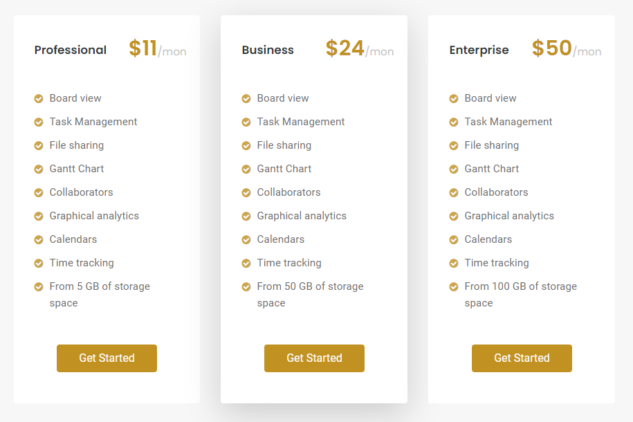
<div class="row">
    <div class="col-12 col-md-4 col-lg-4">
        <div class="pricing-box-one mb-5 rounded">
            <div class="pricing-box-head-one mb-5">
                <h2>Professional <span>$11<small>/mon</small></span></h2>
            </div>
            <div class="pricing-box-body-one">
                <ul>
                    <li>Board view</li>
                    <li>Task Management</li>
                    <li>File sharing</li>
                    <li>Gantt Chart</li>
                    <li>Collaborators</li>
                    <li>Graphical analytics</li>
                    <li>Calendars</li>
                    <li>Time tracking</li>
                    <li>From 5 GB of storage space</li>
                </ul>
                <div class="text-center mt-5">
                    <a class="btn btn-desin-one rounded" href="#">Get Started</a>
                </div>
            </div>
        </div>
    </div>
    <div class="col-12 col-md-4 col-lg-4">
        <div class="pricing-box-one mb-5 rounded shadow-lg">
            <div class="pricing-box-head-one mb-5">
                <h2>Business <span>$24<small>/mon</small></span></h2>
            </div>
            <div class="pricing-box-body-one">
                <ul>
                    <li>Board view</li>
                    <li>Task Management</li>
                    <li>File sharing</li>
                    <li>Gantt Chart</li>
                    <li>Collaborators</li>
                    <li>Graphical analytics</li>
                    <li>Calendars</li>
                    <li>Time tracking</li>
                    <li>From 50 GB of storage space</li>
                </ul>
                <div class="text-center mt-5">
                    <a class="btn btn-desin-one rounded" href="#">Get Started</a>
                </div>
            </div>
        </div>
    </div>
    <div class="col-12 col-md-4 col-lg-4">
        <div class="pricing-box-one mb-5 rounded">
            <div class="pricing-box-head-one mb-5">
                <h2>Enterprise <span>$50<small>/mon</small></span></h2>
            </div>
            <div class="pricing-box-body-one">
                <ul>
                    <li>Board view</li>
                    <li>Task Management</li>
                    <li>File sharing</li>
                    <li>Gantt Chart</li>
                    <li>Collaborators</li>
                    <li>Graphical analytics</li>
                    <li>Calendars</li>
                    <li>Time tracking</li>
                    <li>From 100 GB of storage space</li>
                </ul>
                <div class="text-center mt-5">
                    <a class="btn btn-desin-one rounded" href="#">Get Started</a>
                </div>
            </div>
        </div>
    </div>
</div>
Note For demo, You can please check this in elements/pricing-table.html.
Beautiful process step to display your content with attractive look. See below image and code for more information.
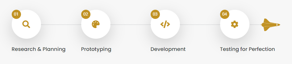
<div class="row">
    <div class="col-12 col-md-3 col-lg-3">
        <div class="process-box-one mb-5">
            <div class="process-box-head-one mb-4">
                <span>01</span>
                <i class="fas fa-search"></i>
            </div>
            <div class="process-box-body-one">
                <h3>Research & Analysis</h3>
                <p>
                    Lorem Ipsum is simply text of the printing and typesetting standard industry.
                </p>
            </div>
        </div>
    </div>
    <div class="col-12 col-md-3 col-lg-3">
        <div class="process-box-one mb-5">
            <div class="process-box-head-one mb-4">
                <span>02</span>
                <i class="fas fa-palette"></i>
            </div>
            <div class="process-box-body-one">
                <h3>Prototyping</h3>
                <p>
                    Lorem Ipsum is simply text of the printing and typesetting standard industry.
                </p>
            </div>
        </div>
    </div>
    <div class="col-12 col-md-3 col-lg-3">
        <div class="process-box-one mb-5">
            <div class="process-box-head-one mb-4">
                <span>03</span>
                <i class="fas fa-code"></i>
            </div>
            <div class="process-box-body-one">
                <h3>Development</h3>
                <p>
                    Lorem Ipsum is simply text of the printing and typesetting standard industry.
                </p>
            </div>
        </div>
    </div>
    <div class="col-12 col-md-3 col-lg-3">
        <div class="process-box-one mb-5">
            <div class="process-box-head-one mb-4 launch">
                <span>04</span>
                <i class="fas fa-cog"></i>
            </div>
            <div class="process-box-body-one">
                <h3>Testing for Perfection</h3>
                <p>
                    Lorem Ipsum is simply text of the printing and typesetting standard industry.
                </p>
            </div>
        </div>
    </div>
</div>
Note For demo, You can please check this in elements/process-step.html.
Beautiful subscribe box to display your content with attractive look. See below image and code for more information.
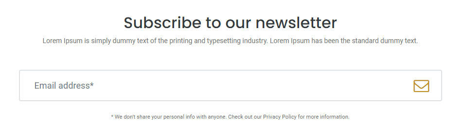
<form class="subscribe-one">
    <h2 class="text-center">Subscribe to our newsletter</h2>
    <p class="text-center mb-5">
        Lorem Ipsum is simply dummy text of the printing and typesetting industry. Lorem Ipsum has been the standard dummy text.
    </p>
    <div class="form-group position-relative">
        <input type="text" class="form-control" placeholder="Email address*" required />
        <button type="submit"><i class="fa fa-envelope-o"></i></button>
    </div>
    <small class="text-center d-block mt-4">
        * We don't share your personal info with anyone. Check out our Privacy Policy for more information.
    </small>
</form>
Note For demo, You can please check this in elements/subscribe.html.
Beautiful team to display your content with attractive look. See below image and code for more information.
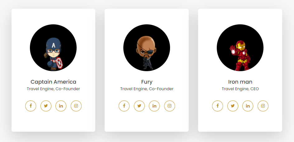
<div class="row">
    <div class="col-12 col-md-4 col-lg-4">
        <div class="team-box-one">
            <img src="../assets/img/team/captain-america.png" alt="">
            <h2>
                Captain America
            </h2>
            <h5>iconic, Co-Founder</h5>
            <div class="team-social">
                <a href="#!"><i class="fa fa-facebook"></i></a>
                <a href="#!"><i class="fa fa-twitter"></i></a>
                <a href="#!"><i class="fa fa-linkedin"></i></a>
                <a href="#!"><i class="fa fa-instagram"></i></a>
            </div>
        </div>
    </div>
    <div class="col-12 col-md-4 col-lg-4">
        <div class="team-box-one">
            <img src="../assets/img/team/funky.png" alt="">
            <h2>
                Fury
            </h2>
            <h5>iconic, Co-Founder</h5>
            <div class="team-social">
                <a href="#!"><i class="fa fa-facebook"></i></a>
                <a href="#!"><i class="fa fa-twitter"></i></a>
                <a href="#!"><i class="fa fa-linkedin"></i></a>
                <a href="#!"><i class="fa fa-instagram"></i></a>
            </div>
        </div>
    </div>
    <div class="col-12 col-md-4 col-lg-4">
        <div class="team-box-one">
            <img src="../assets/img/team/iron-man.png" alt="">
            <h2>
            Iron man
            </h2>
            <h5>iconic, CEO</h5>
            <div class="team-social">
                <a href="#!"><i class="fa fa-facebook"></i></a>
                <a href="#!"><i class="fa fa-twitter"></i></a>
                <a href="#!"><i class="fa fa-linkedin"></i></a>
                <a href="#!"><i class="fa fa-instagram"></i></a>
            </div>
        </div>
    </div>
</div>
Note For demo, You can please check this in elements/team.html.
Beautiful portfolio to display your website attractive look. See below image and code for more information.
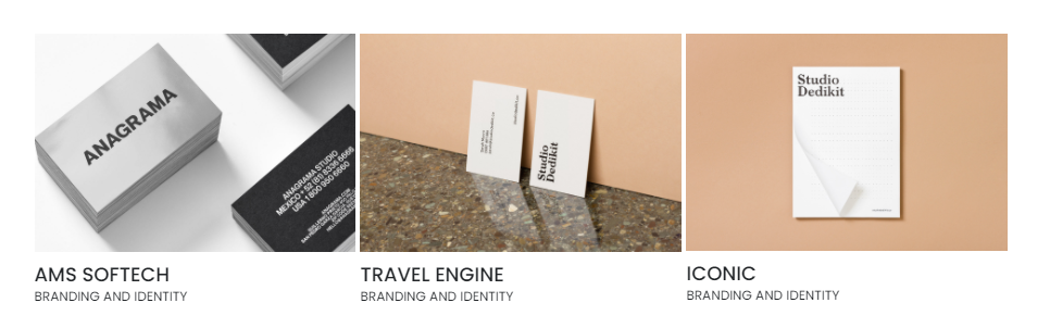
<div class="portfolio">
    <div class="row">
        <div class="col-sm-6 col-md-3 animatable bounceIn">
            <a class="lightbox" href="assets/img/portfolio/p1.jpg">
                <img src="assets/img/portfolio/p1.jpg" alt="Branding and Identity">
                <h3>
                    AMS Softech
                    <small>Branding and Identity</small>
                </h3>
            </a>
        </div>
    </div>
</div>
<!--baguette js-->
<link rel="stylesheet" type="text/css" href="assets/baguette-box/baguette.min.css">
<script src="assets/baguette-box/baguettebox.js"></script>
Note For demo, You can please check this in portfolio-four-column.html.
We would really love to take this opportunity to appreciate guys whose items were helpful to us to make iconic a really beautiful theme for our awesome users:
We've tried to make this documentation as easy and understandable as possible. However, in case of any difficulties with the theme, you can contact our technical support department with any suggestions regarding documentation and theme improvement.
Your read it entirely. Thanks!